A Visualisation for Every Digit of Data
Published on Oct 15, 2019 7:00 AM

A Visualisation for Every Digit of Data
Our goal is to provide you with everything you need to create engaging data stories for any audience or situation. Each insight within your data is paired with the perfect visualisation to help bring the numbers to life.
There’s already a wide range of different visualisations available on the data storytelling platform. We're constantly developing new ones to keep things fresh and ensure there's something for every possible scenario. Here’s a run-through of some of the new visualisations we’ve added to the mix recently.
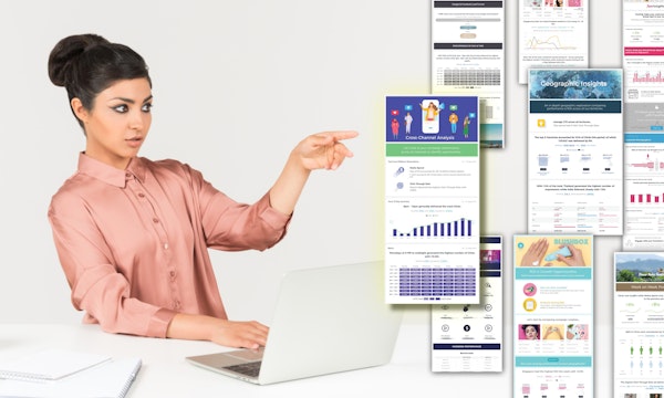
Demographic Insights
For each different data source and metric we aim to provide a range of visuals to showcase that particular data in the best way possible. We’ve recently released a number of new visualisations to display Age & Gender insights. So, whether you prefer a simple pie chart or something a little more unique, you’ll find just what you need with >10 different options to pick from.

Image shows user browsing different visualisations previews for demographic insights.
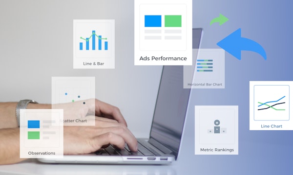
More Visualisations for Any Type of Data
Do you use Nugit to pull in custom data? Not a problem! We’ve expanded our Visualisation Gallery to include more options than ever before to showcase your custom / CSV data. There’s lots to explore including Age & Gender Infographics and Geographic Infographics. Can’t find what you need? The Key Metrics nugit lets you craft your own custom sentences containing dynamic data that will automatically update. You can also add your own images or icons to further tailor it for any situation.

Track Your Progress
Working towards a goal or KPI? We’ve added a handy progress bar to Table Chart Visualisations so that you can see, at a glance, how each line is progressing towards the target. Be warned, it’s highly satisfying!
See Your Ad Creatives
We know that when you’re running a lot of ads, looking for optimisation opportunities can quickly get confusing. Which one was that again? That’s why Nugit data stories display thumbnails of your campaign creatives to make it easier to review performance.

This is currently supported across Google Ads, Facebook Ads, Facebook Pages, Instagram Organic, Linkedin, Twitter, Twitter Organic, Google Marketing Platform (previously Double Click Manager), Google Search Ads, (previously DoubleClick Search) & Oath (formerly Yahoo Gemini).
More Great Little Features You Might Notice...
- Annotations & highlights. Using this handy tool you can quickly draw attention to the most important parts of your story and give it a personal touch!![]()
- Custom Fonts
- Upgrades to the way tables are displayed
- More formatting options for surveys and custom data sets
- Improved navigational buttons on live views to help readers interact with stories
If you’d like to understand more about any of the new updates mentioned above, your Nugit Customer Success Manager will be happy to help. If you’re not yet a Nugit user but would like to learn more, request a demo and one of our team will be in touch.